Retail · Operations
Making operational work legible at enterprise scale
Mapped authenticated and operational digital experiences for store and support teams at The Home Depot, turning scattered tooling into one coherent, accessible end-to-end workflow.
- Company
- The Home Depot
- Role
- Staff UX Designer
- Timeline
- Jun 2025 – Jan 2026
- Partners
- Product, Engineering, Ops
The challenge
What wasn't working
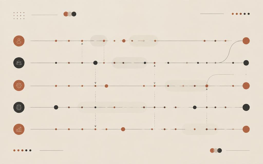
Operations users were moving through authenticated tools that had grown one feature at a time. Each system solved its own problem, and nobody owned the space between them — so the work that mattered most happened in the gaps: re-keying data, chasing status, holding context in their heads.
Leadership could see the symptoms — slow task completion, accessibility gaps, repeated rework between design and development — but not the shape of the problem. There was no single view of the end-to-end experience anyone could point at.
The work
How I approached it
Artifacts
- Current-state and future-state journey maps
- Service blueprint with system and ops layers
- Accessibility annotations to WCAG standards
- Validated interactive prototypes
- Pattern-level synthesis of 100+ observations
Discovery grounded in the real workflow
I led discovery with Operations users, combining interviews with walkthroughs of their actual tasks. Instead of testing screens in isolation, I traced complete jobs from trigger to resolution so the friction showed up where it actually lived — at the handoffs.
Journey mapping the authenticated experience
I mapped current-state journeys across the authenticated and operational surfaces, layering user actions, system responses, and the manual workarounds people had invented. The map made the invisible labor visible and gave the team a shared object to argue with.
AI-accelerated synthesis
I used AI-supported synthesis to work through 100+ testing observations, clustering them into usability patterns rather than a list of one-off defects. That shifted the conversation from fixing individual screens to fixing the categories of breakdown, and cut documentation time on blueprints by roughly 30%.
Accessible, system-aligned design
I designed the future-state flows against WCAG standards and the established design system, reusing platform patterns across 20+ digital touchpoints so consistency came for free and handoff moved faster.
Two rounds of validation before build
Rather than hand off and hope, I ran two validation rounds with Operations users and stakeholders, using AI-assisted prototypes so people could react to something concrete early in discovery instead of late in delivery.
Deep dive · Usability readout, Jan 2026
Program Builder: testing a loyalty challenge tool before launch
What
Usability testing
When
Dec 17 – Jan 7
Who
5 users, Marketing & Ops
Goals
Program Builder streamlines creating and managing loyalty challenges. The goal was to make sure it felt intuitive for people who already know LMS and challenge-building workflows — reducing friction and improving adoption. I also looked for usability issues in navigation, labeling and workflow, and measured how confident users felt.
Main questions asked
- How do users create a new challenge?
- Are required fields and steps easy to identify and complete?
- Can users confidently add rewards and audiences?
- How intuitive are editing and launching challenges?
- Overall usability perception (SUS-based questions)
SUS score
86.25
A+ · above 68 is above average
Previous LMS Rewards tool: 51.8 (D)
Challenges concept, May 2025: 84.4 (A+)

Methodology
Remote moderated sessions on a high-fidelity prototype. Each participant worked through about eight tasks — creating a challenge, configuring onboarding and transaction steps, attaching or creating rewards, uploading an audience (BigQuery/CSV), then reviewing, editing and launching. They thought aloud as they went, and ten post-test questions produced a System Usability Scale score.
Why this method
- Shows real-time decision-making and pain points
- Participants are actual end-users with varying experience levels
- Prototype testing catches design issues before development begins
“Definitely easy to use, intuitive. Everything flowed exactly how I thought it would.”
What worked
- Found the system intuitive and easy to navigate
- Felt confident using the tool without technical support
- Labels and required fields were clear
- Excited and willing to use the system frequently
- Good cohesion with system integration
- “Challenge Builder” and “Challenge Library” were self-explanatory
- Drag-and-drop reordering of steps was intuitive
- Options to attach or create rewards were clear
- Audience upload process was clear
Pain points
- Possible learning curve for brand-new users
- Expected a “New Challenge” label instead of “Challenge Builder”
- Reward fields (title, short title, description) felt repetitive and confusing
- Expected rewards to auto-save on “Continue” — had to click “Create Reward” first
- Feedback messages were too brief, reducing confidence in task completion
- Audience template download link wasn’t prominent
Recommendations
- Put a “Create a challenge” / “New Challenge” button directly on the homepage
- Add progress indicators and checkmarks for completed steps
- Reduce redundancy or add tooltips for Title vs. Short Title vs. Description
- Make the CSV template link more prominent
- Let users save progress before final submission for review or approval
- Show explicit success confirmation and a summary after launch
- Align button labels with expectations (“Launch Challenge” instead of “Submit”)
Next steps
UX team
Implement the recommended UI changes in upcoming iterations.
Engineering
Persistent success messages and inline reward creation. Future state: save challenge drafts.
Continued feedback
Post-launch tests and surveys with both experienced and novice users.
Outcomes
What changed, measurably
+25%
usability & accessibility
Measured improvement in usability and accessibility scores across the redesigned workflows.
-30%
rework
Two validation rounds before build caught direction problems while they were still cheap to fix.
-25%
handoff time
Reuse of design-system patterns across 20+ touchpoints accelerated design-to-development handoff.
Reflection
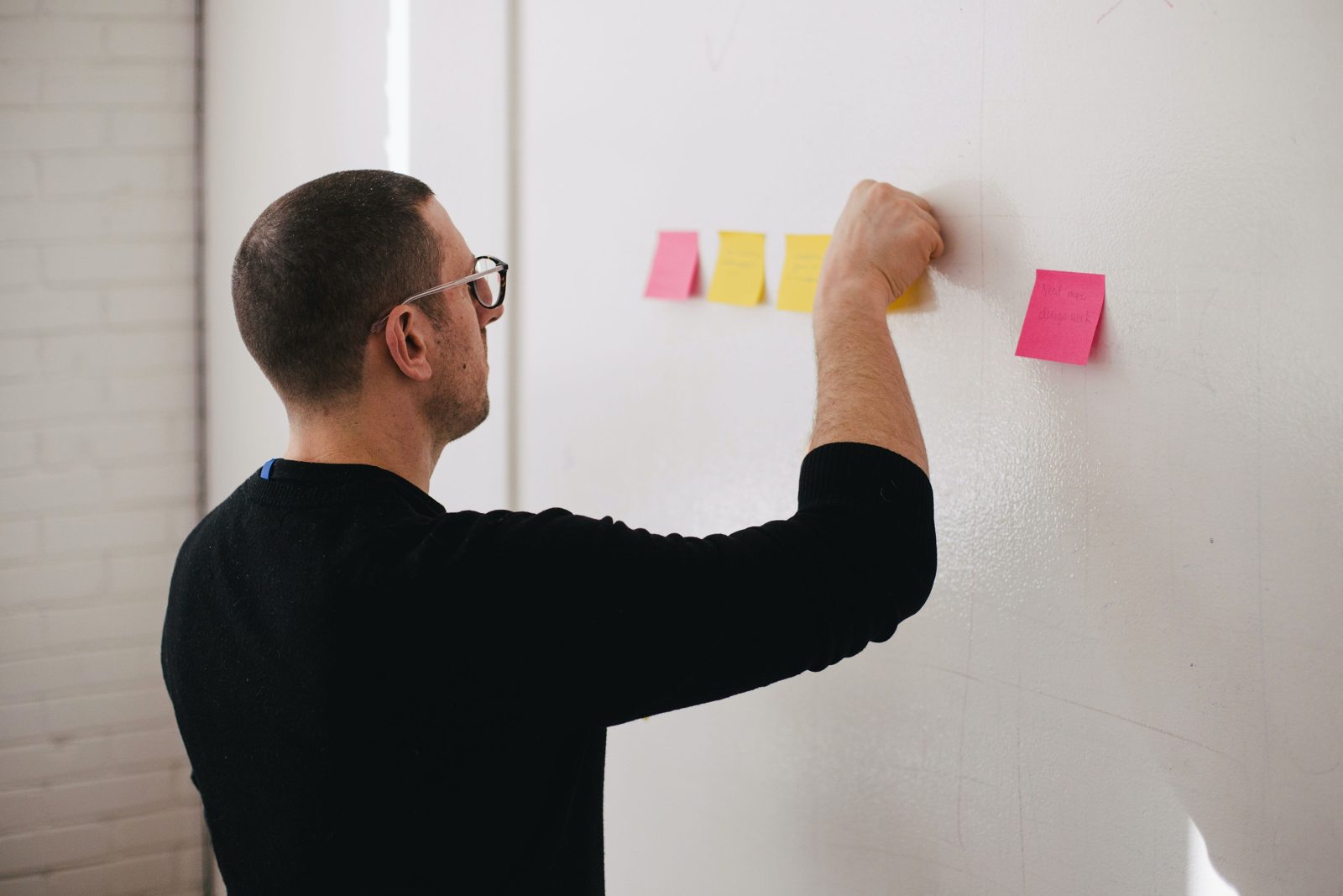
The leverage here wasn't a better screen — it was giving a matrixed organization one legible picture of the work. Once the journey was on the wall, prioritization arguments resolved themselves.
Let's map the journey that's been holding you back.
Open to Lead and Staff UX / Service Design roles.